Sprouts
Rebranding | Logo Design | Illustration | Packaging
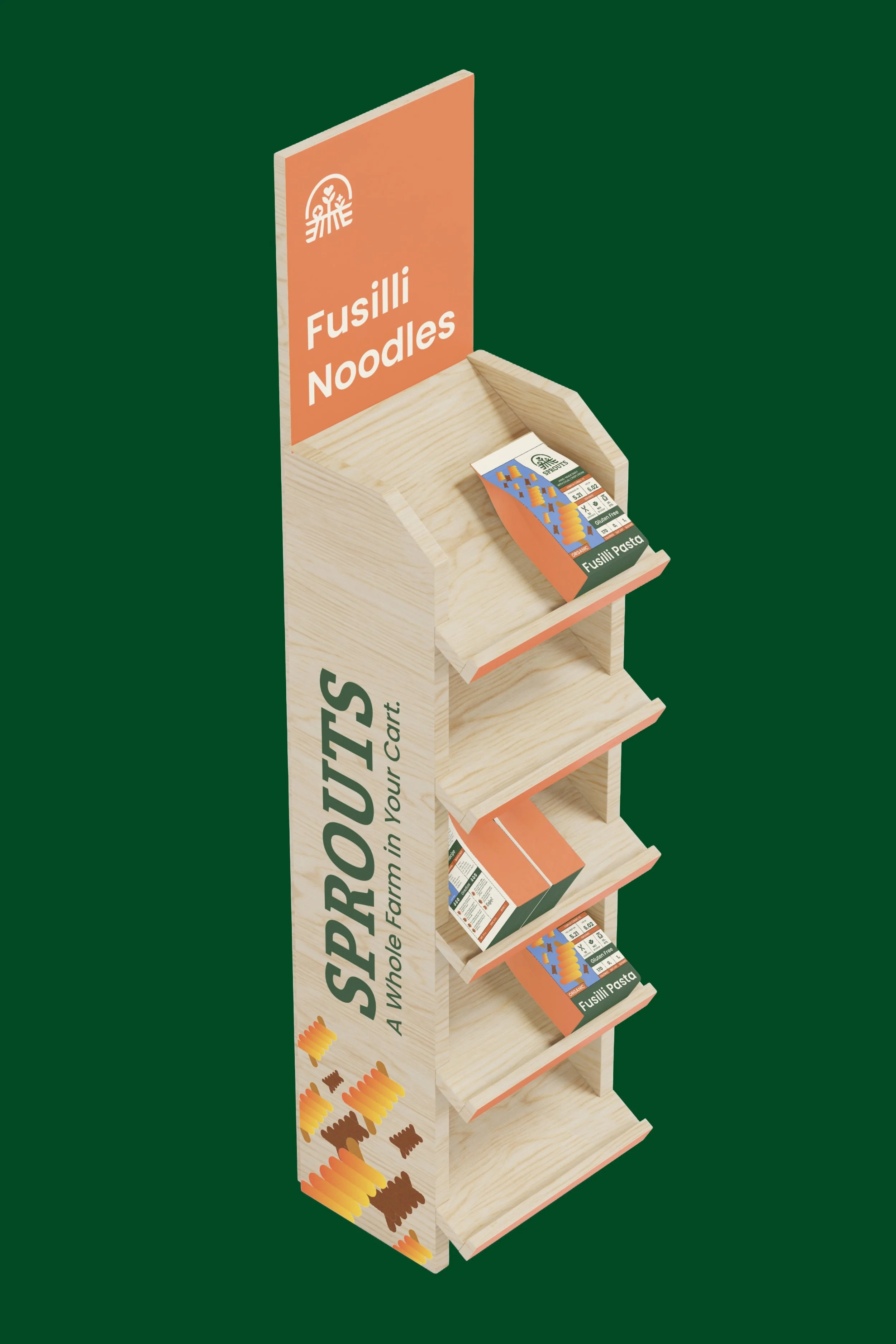
The primary objective of this rebranding effort is to differentiate Sprouts from its competitors, align its brand identity with its core values, and cultivate a more inviting and welcoming atmosphere for customers. The campaign expands through all facets of the store. Each element, from packaging to aisle markers, was designed to create a unique, warm, and welcoming shopping experience.

Logo
The Logo conisists of a shopping basket, a field of crops which doubles as a field of shopping aisles, and three centerfold crops. The logo visually symbolizes the tagline, a whole farm in you cart.
Aisle Markers and Shelves
Staple Products
Annual Report


